Have you ever wondered how to pair graphic pillows so they feel relaxing? Just keep these three things in mind to achieve a cohesive style every time... maintain the proper balance of color, alternate pattern size and vary graphic elements.
Color helps to ground design. If you choose fabrics from one color family (or at least with the same tone) it will unite the patterns; it is a simple way to neutralize a few of patterns.
Once you have chosen a color scheme, select fabric patterns in a variety of sizes. Varying the pattern size allows your eye to rest; the most graphic pillow can be the focal point.
Keep in mind that the graphic elements do not need to match. In fact, it helps make it all work if the patterns feel different too. So, if you are starting with a pillow that has embroidered flowers, add a pillow with bold geometric designs or pair a striped pillow with one that has polk-a-dots.
Here are a few examples of relaxing pillow groupings with lots of graphic punch.
Numerous graphic fabrics are pulled together by maintaining a red and tan color scheme in this pillow grouping. The geometric design is grounded by the large poppy flower while the delicately embroidered flowers on the lumbar pillow helps to soften the pillow collection. Keeping the tones similar but varying the graphic elements is a great way to help your pillows get along.
Zebra stripes can (surprisingly) be paired with other graphic colors as long as the tones are similar. Here the three patterns vary in size which allows each pillow to have its own space yet still feel connected to the others. As in the example above, keeping the colors in the same (general) family help balance the dynamic patterns.
You don't have to stick to just one color, but be sure to keep the tones similar. In this pairing the fuchsia and green colors are both soft, almost pastel, and compliment one another well. Using a variety of graphics and both large and small patterns help to make the collection feel coordinated rather than busy.
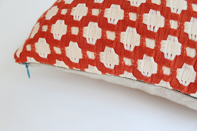
The tangerine color on these three pillows is so bold and implactful; it makes sense to balance this color with designs that are a bit more subtle. Though strong graphic elements are used, the amount is varied as is the pattern size. These pillows feel cohesive and well-styled.
I love the cool-toned mix of these four pillows. The peacock- blue, pleated ribbon ruffle on the white linen lumbar pillow draws attention to itself toning down the larger purple bird pillow. Add to them the giant poppy print on the pale blue pillow (which, is the perfect example of using a larger design element with a subtle color) and you get a soothing yet impactful pillow styling.


